
The Impact
📌 Achieved a 6k revenue in a week when the platform launched a 5 week paid program to the public.
📌 Successfully designed and published a brand identity the founder was happy with.
📌 Created social media assets and presence through IG.
The Challenge
To help an independent founder break through a saturated dance market and build credibility with a major studio partner. Through strategic branding, I positioned the program as both innovative and aspirational, creating a clear identity that drove revenue, elevated community skillsets, and enabled the launch of the first-ever athlete program. After an initial consultation with the founder, my advise was to do begin with user research on the current members to understand the impact his product has created in the community. I offered my help to conduct User Research, which led to an official Logo, Brand Identity, Strategy, and Content in a 2-week time frame.
A little about this project
The program began purely based on word of mouth around October 2020. Personally inviting people to the sessions, keeping it off-grid, and really focus on creating bonds and community for about 3-4 months.
In March 2021, the Founder decided to launch a paid 5-week program to the public in collaboration with IMI Dance Studio. The founder was unsure of how to communicate to the Sydney dance community on the value of this program and wasn't sure how and what to promote.
TRIPLE-T - Tools, Training and Therapy - is the innovative dance and health program uniquely designed to build your everyday dancer to the next level dance athlete. Focusing in full mind-body awareness within dance, choreographic style versatility and optimal dynamic performance.
________________________________________
✹ Discovery
The strategy to conduct research was to focus the questions around four pillars of the platform: Fitness, Dance, Community & Perspective of Triple-T
After reaching out to current members of the platform and synthesising the qualitative research, the data began to form patterns.
✹ Define
Once the data showed the different types of dancers Triple-T catered to, after workshops and meetings with the Founder, it was agreed The Protégé Mindset, would be the one to highlight. The reason? A dancer's mindset is important to their evolution, if there is passionate, drive and hunger to be better, then they are not afraid to sought out challenges and mentors to make the leap from dancer to athlete.
The Protégé mindset dances to seek expression, evolve and challenge.
Movement is therapy to them. They’re on their dance journey but lately, choreography classes haven't been of a challenge for them. Making them feel stuck with their current level.

Triple-T's opportunity help dancer's sat within the 'Explore Programs' phase. To take this opportunity, Branding elements needed to be created. In particular:
- Logo
- Visual communication style
- Social proof + Social media channel
- Content strategy
Triple-T now needed to be discoverable if the business goal was to communicate with users within the 'Explore Programs' phase, and collectively Triple-T needed to visually communicate with users.
✹ Develop
The data discovered current member's main perspective of Triple-T was community, foundation, a home away from home.
To brainstorm and workshop ideas, a crazy 8s session was facilitated with these two insights in mind. The aim was to find something abstract yet full of story and meaning.
The founder assessed the sketches and after discussions -
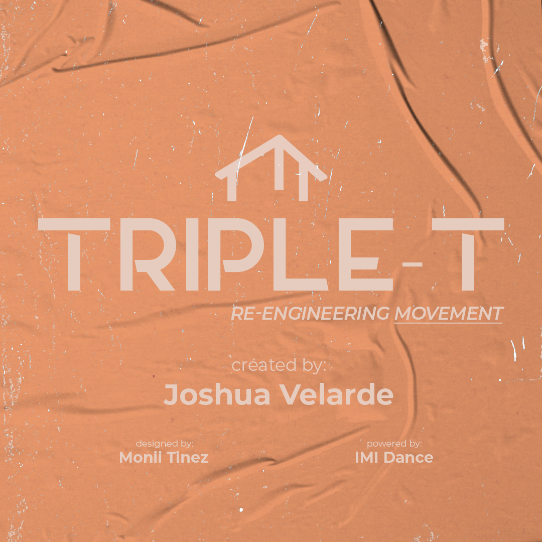
We happily agreed on this final logo.
The thought process behind it:
- To use the T's to create a home and give the logo a little dimension so it's not so flat.
- It has sharp edges that match the energy of the explosion emoji.
- Later I added TRIPLE-T under the logo, which gave it a nice feel of a platform
- I was also aware and conscious about Merch ( a very important asset to a dancer) and I aimed to create something that would look good on a shirt, jumper, trackies, hats, water bottles, and towels. - Something that wasn't so loud when worn and dancers would happily wear it outside of dance.
✹ Deliver
The 5 week program went public in March 2021, and the campaign ran for one week.
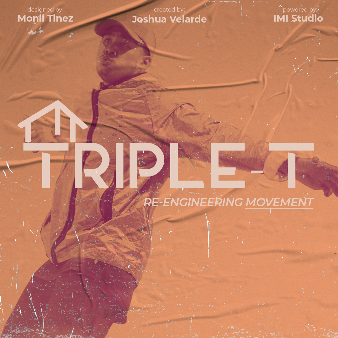
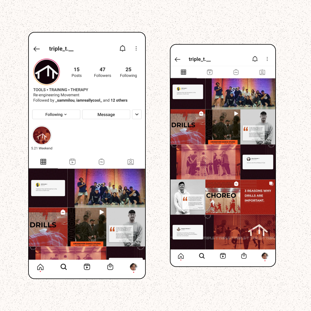
This is the first impression Triple-T would make to the public. I wanted to ensure value was being added to an already valuable product and create something Triple-T would be remembered by - whether it was the colours or the logo. These are the assets we used on the founder's IG and IMI Studio's IG.
- We used the founder's face for friendliness, reliability, and credibility
- Encapsulate the street vibes by using street glue poster overlay
- A use of powerful and bold colour
- A use of Two Tone design technique to gain The Protege's attention
- Create a slogan - Re-Engineering Movement - so The Protege knew exactly what Triple-T is about without much context.
We created a channel to promote the program and the 5 week program - these are the results that was generated:
- Converted 1/3 of users to paying customers
- Registered 18 dancers - our goal was 15
- Achieved a 6k revenue
- Created a complete brand identity for Triple-T
- Increased awareness and interest in a dancer's mobility and stability dance
- Increased awareness about the importance of athleticism other than the common type of dance training
- Instagram analytics on the poster on the day of launch →
✹ Wrap Up
This is by far one of the favourite products I have worked on. Contributing to the growth of dancers, their health and mental health is great joy. Triple-T and I continue to work together closely to keep elevating the brand and product.
✹ Testimonials
"I didn't know what UX was or how it could be used with dance, but Monii did such an incredible job to guide me and I have learnt so much about my own product because of this process" -Joshua, Founder Triple-T
"Every time I see a house shape or anything like it, I think of Triple-T - you know because of the logo?" - Shantelle, Dancer, Choreographer
"I'm happy I worked with you (Monii), the way (she) worked with the hard deadlines and the quality of work (she) produced in such a short amount of time - (she's) so easy to work with" -Ryu, CEO IMI Dance Studio